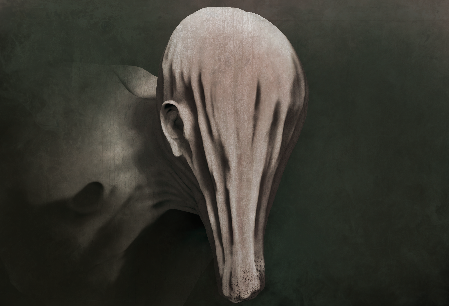
In this sculpt i went further with my experimentation with form, and the way that we perceive it.
The base of the sculpt, the "head" has no human characteristics and falls downwards like stretched cloth, to try get a feel for what this would look like i placed a bag of rice into a bed sheet, pulling the cloth downwards, then adapted that kind of feel for the skin pulling downwards.
Taking inspiration from the artists i have been looking at i added an anchor point for the imagination, using a clearly human ear to make sure that it looked like a head, even though it had no other features.
The final composition and colour balance, i tried to get the same feel as one of Jase Daniels sculpts by expanding the canvas into a large open space to the right and the use of foreground particles.
This image is compiled of renders from ZBrush overplayed onto one another in photoshop, along side textures, and a small amount of digital painting to blur it into the background and correct the shape of the ear. I also used Photoshop to colour the image and darken the shadows a bit more.
Im happy with the results but still feel like its lacking a lot of the surface detail and some compositional elements. Using multiple renders in photoshop is a useful and easy method but I'm washing out a lot of the detail because it uses multiple exposures of the same areas. A possible remedy to this would be to spend more time setting up custom lighting for each piece in ZBrush rather than creating the lighting in photoshop. This would hopefully leave more of the tiny details intact and make it more appealing to look at.
This is one of Jase Daniels Pieces, and uses the anchor method i have previously defined with the bottom jaw, meaning you see the other distorted shapes and forms as a face. The surface detail is part of what makes the piece so visually intriguing and is something i want to work toward.
Early blocking out of the shapes
Close up of the end of the face, trying to make it look infested by bugs, like a hive.
The creases took a few attempts to get right, rather than adding the areas where the peaks were i found it more effective to take away the crevice as otherwise the sudden rises took away from the skin looking like it was being pulled taught downwards.

Below are a variety of different colour tints for the image, giving different feels. I went with the yellow and green tinted one as a final as it gave the skin a warmer feel, but still an inhuman look to it.


