Showing posts with label Creative Research. Show all posts

19/04/2015

Feedback from the Final Presentation

I was really happy with how the presentation worked out. I prepared heavily for it because i was so nervous and i think that showed, i got my points across eloquently and managed to talk constantly for five minutes only having to pause and think of what i was going to say once.

The feedback was very good, saying they could see a clear progression in my work, strong presentation of my ideas and thorough and concise analysis of other artists work. The part that i felt best about was a comment a long the lines of "When i first heard ZBrush i sighed, but after seeing what you have done with it i think you brought original ideas out of your work"


07/04/2015

Pipe Head Sculpt.


With this piece i tried to abstract the form of the model even more, providing very limited reassurance that it is intact a head. 

I used the tubes or pipes as a way to experiment with what you would recognise as a face, and also to try to draw the eyes around the image, leading them from the "jaw" to the nose.

I also started out with the composition in mind, wanting the inside of the head to fade away into the background from the very beginning, as an imitation of the way Jase Daniels work joins seamlessly with the backgrounds, and reminiscent of the way Zdislaw Beksinski's later works forgo realistic backgrounds entirely.

I had a couple different angles that i rendered out, considering the form of the head, trying to clearly show the nose, being the only true facial feature.


The Above image is my favourite of the renders. I like the colour contrast between the model and the background, i also think that the background fade in is aggressive enough to leave some mystery as to the final form of the model. I also think the angle makes it clear that it is meant to be a portrait but it isn't too obvious.


This is my second favourite of the final compositions, i like its warm colours but feel that the face is almost too obvious , with a clear mouth hole, eye socket and jaw line, but this could just be because i have been staring at it for a few days.


Through experimenting i also found a very efficient way of fading the backgrounds in,.Rather than trying to slowly paint the fade in i can take the depth map from ZBrush, invert it, then use it as a layer mask, to make the fog accurately fade over the model.


Example of one of the Brush renders i used.


Below are examples of the other renders i used to compile the final images.


05/04/2015

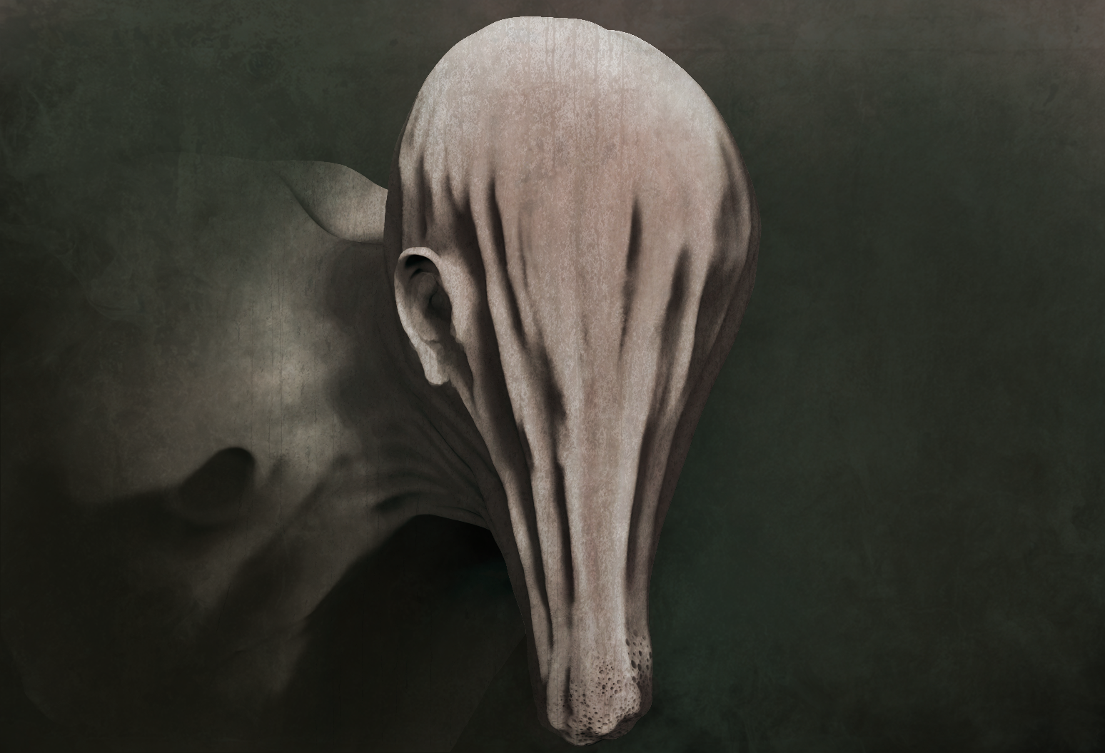
Hanging Face Sculpt

In this sculpt i went further with my experimentation with form, and the way that we perceive it.

The base of the sculpt, the "head" has no human characteristics and falls downwards like stretched cloth, to try get a feel for what this would look like i placed a bag of rice into a bed sheet, pulling the cloth downwards, then adapted that kind of feel for the skin pulling downwards.

Taking inspiration from the artists i have been looking at i added an anchor point for the imagination, using a clearly human ear to make sure that it looked like a head, even though it had no other features.

The final composition and colour balance, i tried to get the same feel as one of Jase Daniels sculpts by expanding the canvas into a large open space to the right and the use of foreground particles.

This image is compiled of renders from ZBrush overplayed onto one another in photoshop, along side textures, and a small amount of digital painting to blur it into the background and correct the shape of the ear. I also used Photoshop to colour the image and darken the shadows a bit more. 

Im happy with the results but still feel like its lacking a lot of the surface detail and some compositional elements. Using multiple renders in photoshop is a useful and easy method but I'm washing out a lot of the detail because it uses multiple exposures of the same areas. A possible remedy to this would be to spend more time setting up custom lighting for each piece in ZBrush rather than creating the lighting in photoshop. This would hopefully leave more of the tiny details intact and make it more appealing to look at.


This is one of Jase Daniels Pieces, and uses the anchor method i have previously defined with the bottom jaw, meaning you see the other distorted shapes and forms as a face. The surface detail is part of what makes the piece so visually intriguing and is something i want to work toward.


Early blocking out of the shapes


Close up of the end of the face, trying to make it look infested by bugs, like a hive.


The creases took a few attempts to get right, rather than adding the areas where the peaks were i found it more effective to take away the crevice as otherwise the sudden rises took away from the skin looking like it was being pulled taught downwards.


Below are a variety of different colour tints for the image, giving different feels. I went with the yellow and green tinted one as a final as it gave the skin a warmer feel, but still an inhuman look to it. 


02/04/2015

Surrealist Sculpt.

A piece that i have been working on for the last few days, i have started to realise that my necessity to conform with anatomy was holding me back, where as really all i needed were  few anchor points to put the idea that its a head into your mind.

Another popular theme in surrealist art are tentacles, or ling thin strands connecting parts creatures, in this image i used a large chunky tentacle going from where a tongue should be , into an eye socket, supporting the upper part of the head.

Another staple of Jase Daniels work is that his pieces look more like paintings than realistic renders. He accomplishes this through his strong composition, his stylised colour palette but also the use of layers textures, both on the sculpt itself and on the final image. 

This is something i have tried to achieve with this image, I've used the Spotlight feature of ZBrush to apply textures to the sculpt,  swell as making a conscious effort to admire depth to details across the sculpt, trying to make the shadows more intense.


In this piece i used the ear, and the shape of the eye socket as anchors to realty.

I feel like it is a successful image, but i lost some of the detail in the eye socket and across the skin. I also need to practice integrating my sculpts into the surroundings, using them to tell a story


the sculpt is partly inspired by this advert for foundation i saw while shopping, it made me stop and check whether her face was floating, and it was what gave me the idea to separate the face into blocks.


The sculpt finished in ZBrush, i used photoshop to add the colour and add some more textures to the skin. 


As i started needing more in-depth and detailed textures for my sculpt I've been experimenting with using photos to add detail. Ive found it gives me interesting and unique results far more quickly than trying to do it all by hand. Its also helped expand my texture library.


An intersting version of the image, i don't think its particularly useful but i do like the way that it shows the texture of the sculpt.


This was the final composition of all the render layers, textures and colours that i put into the image.


01/04/2015

Jase Daniels and the Progression of my Project.

I recently stumbled upon the work of Jase Daniels, or Grot (his internet alias) and I'm completely enthralled. Ive learned a lot by studying his work and it has changed the way i think about my project and what i have been doing.

His work is the closest I've seen to Zdzisław Beksiński that is made in 3D and is a testament to surrealism in ZBrush.


A common theme that i have identified with surrealist design is that whilst some parts of the creatures are completely alien to what we know and recognise, but there are always anchor points in the anatomy that make our brains recognise it as human. With some of Jase Daniels work there is nothing that we would recognise as a face in the image, but because there is an ear, or a nose, or a hand nearby it forces our imaginations to recognise it as a head and this is something i would love to be able to replicate effectively.


I love the design of the creature in this picture, the recognisable arrangement of the limbs and the shape of the torso firmly cements the figure as being humanoid, but all of the fine details are so alien that it makes it a very interesting piece. The way the leg ends in what looks like a finger is very interesting, the wrinkles across the stomach give the model a texture that draws the eye, and the "head" with the gaping hole in it is very unsettling.


This piece is more human, but the movement of the left eye downwards and the craters in the face make it far less uniform and more interesting to look at. The lighting and dust particles give it the impression of being hidden in a dark room, and the composition with the right side being dark reinforces this impression.


This piece is slightly more human than the last, but the proportions are exaggerated across the neck and back of the head. 


This piece is completely devoid of a face, but is still clearly a head thanks to the ear, which anchors your imagination to seeing it in a  certain way.

27/03/2015

Progression of my project.

Recently I've noticed my work shifting further and further from he character design roots and more to making a final image. The influence of surrealist artists has definitely had a strong impact and I've started focussing more on the presentation of my work and less on the technical detail.

Ive been experimenting with sculpting using far more abstract forms, but trying to anchor the designs to reality using recognisable parts of anatomy. 

I would say the Vision Statement of my project has changed over the recent months and it has taken me a while to really nail down what i am doing but I'm confident with the direction that i have been going in, i just wish that i had the major break through in thinking a few months ago.

My new vision statement is 

The portrayal of surrealist imagery using ZBrush.

25/03/2015

Conjoined Sculpt

This idea, whilst not particularly original, has been floating around my head for a while.

Moving forward with more of the surrealist ideas that i had been working with, the manipulation of form, or rather lack of form, was something i wanted to examine.

Whilst trying to maintain anatomical accuracy i wanted to combine two bodies into one another, one almost tearing free from the other, but how would that work in 3D , could i maintain the sense of movement, but also the sense of ambiguity.

Starting with a sketch to establish the main blocks of anatomy i wanted to be in the final image.


I started out experimenting with the head, exploring the facial expressions and the way the skin would merge between the two.


Looking at ways other Zbrush artists worked, i decided to split the hands into separate tools, so i could easily manipulate the fingers and make the crease that appears between the hand and the shoulder more realistic.


The final composition.


I was greatly inspired by the sculpture "The Rape of Proserpina" the way the hands and the body pressed into one another, giving a real sense of weight and tension throughout the sculpture.

Whilst it would be vastly over reaching to say i aimed to get a look as refined and beautiful as this sculpture i feel like examining it helped me understand how i can bring some life into my sculpture.


12/02/2015

Finals of the Flute Sculpt


 So i have spent a lot longer on this than i originally intended, i felt like i hit a brick wall with the project as a whole and this piece was an idea that was born of desperation rather than inspiration, and such it took me longer to complete.

I felt like i had lost the direction of my project, focusing less and less on the theory behind the work and more on the technical skills, which isn't what this module is meant to be about.

Therefore I'm about to move back into the realm of the more abstract , thinking about how other mediums and practices can impact my workflow, and also about the audience my work is intended for. Ideally I'm heading into creature and character modelling for games, and my work should start to reflect that.

With the sculpt i finished as much detail as i felt was really necessary. Considering that i was doing it as what i would loosely describe as a "master study", trying to take influence from his design choices, from his lighting and composition and try to take elements of this into 3D

The lighting is a fair representation of the lighting in in the painting, but the background is by no way on par with his. I settled fro  a simple gradient where as the original picture is textured with brush strokes and colour in a subtle but interesting way.

I compiled this image the same way as my last sculpt, using a variety of renders from ZBrush with different lights, materials, shadows and rim lights to make a composition of all the light sources.


An example of some of the renders i used to compile the final image.


This is my favourite render, the strong contrast of the light and shadows, as well as the film grain effect give it a striking and i think, frightening appearance. The Iris blur i put around the edge leads the eye towards the hands, the real focus of the original painting.


With these images i overlaid film grain, an effect commonly used in horror games and films to give detail to shadows and darkness, to give things a subtle sense of movement, or to obscure the viewer from seeing things too sharply. Sometimes the enemy of fear is clarity, shrouding details can make the image more compelling.


The same image as above without the film grain.


After assembling all the layers and producing a composite image its easy to play with colour and saturation of the image. I quite liked the washed out pale version, it gave a far different feel to the piece however, making it colder and more corpse like, and made it seem less like a living thing, more like a statue or corpse.


Increasing the Saturation to a more orange look in some ways brought it closer to the painting, but made the highlights far too vibrant.


The plain sculpt


Plain sculpt without the background.


17/01/2015

Start of a New Sculpt

To Further my composition and render knowledge I'm going to attempt to make a 3D render of the character and then try to make the render look similar to the painting.

This is the base mesh for the sculpt, the arms are still a bit short and the neck is a bit fat at the moment. One problem i may face is that the body is very detailed but isn't segmented in any way. Meaning i will have to make the mesh very high resolution and can't make it into separate sub tools, Aside from the trumpet.